Executive Summary

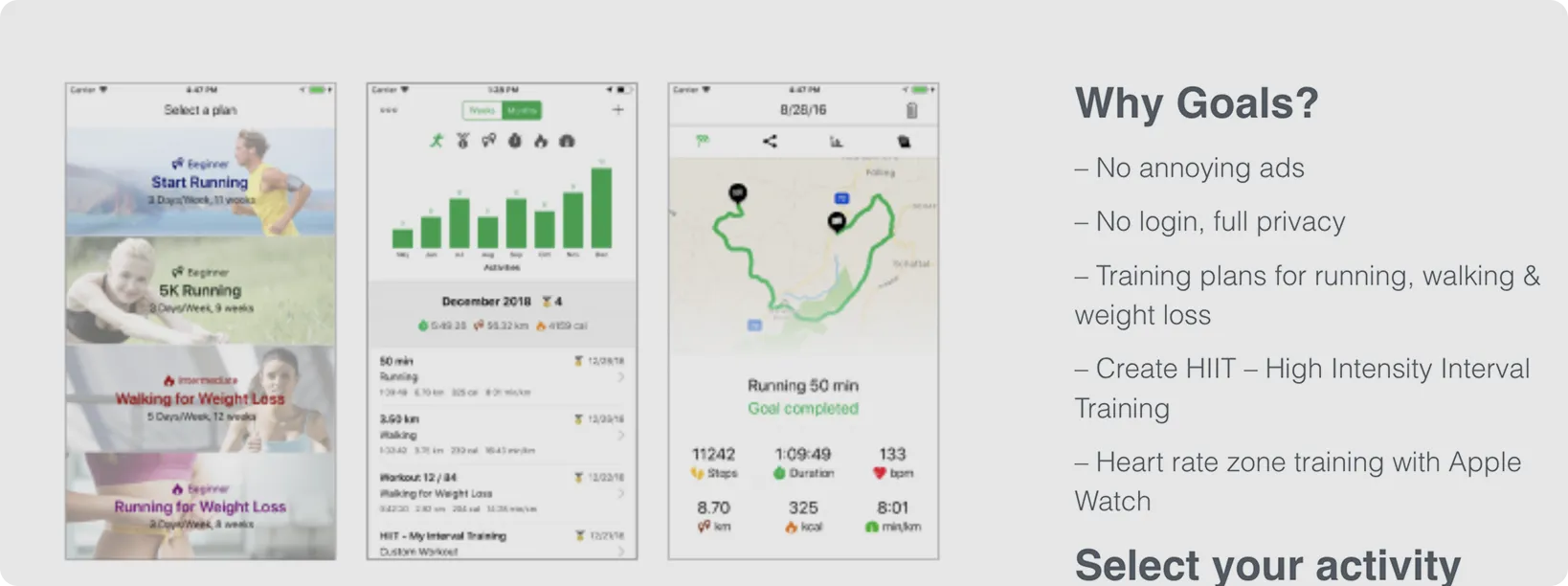
Outdated landing page didn't reflect quality of 4.7★ app with 3.2K+ users
Text-heavy layout, poor visual hierarchy
Generic design patterns from early 2010s
Not optimized for mobile viewing
Competitive analysis of 15+ fitness app landing pages
UI heuristic evaluation using Nielsen's principles
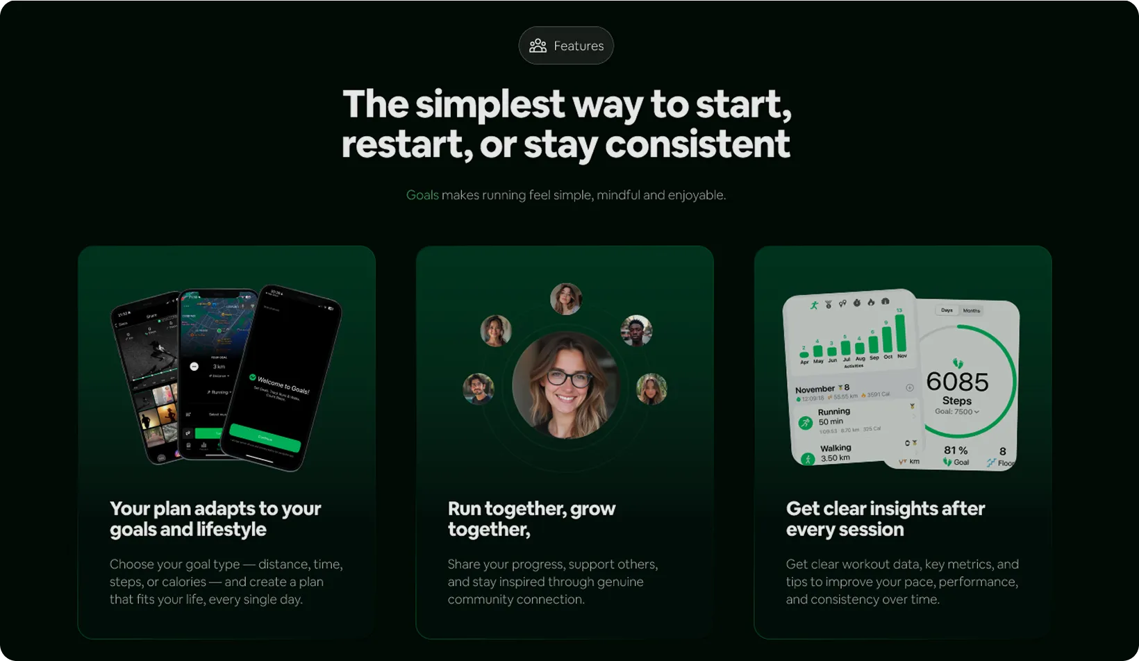
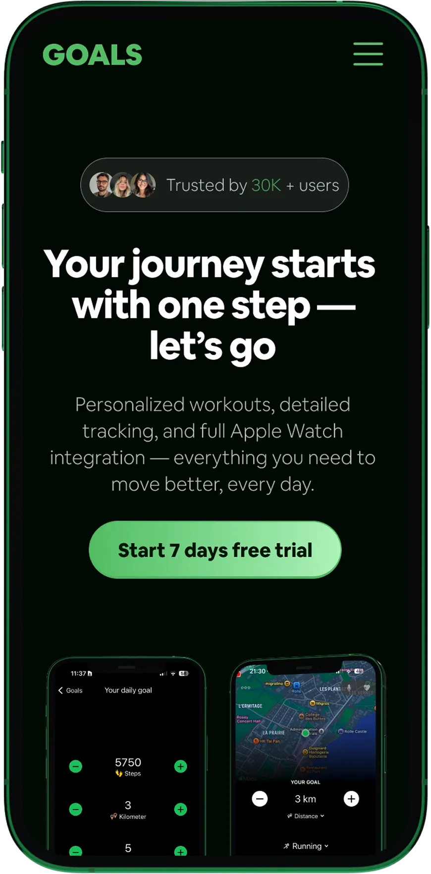
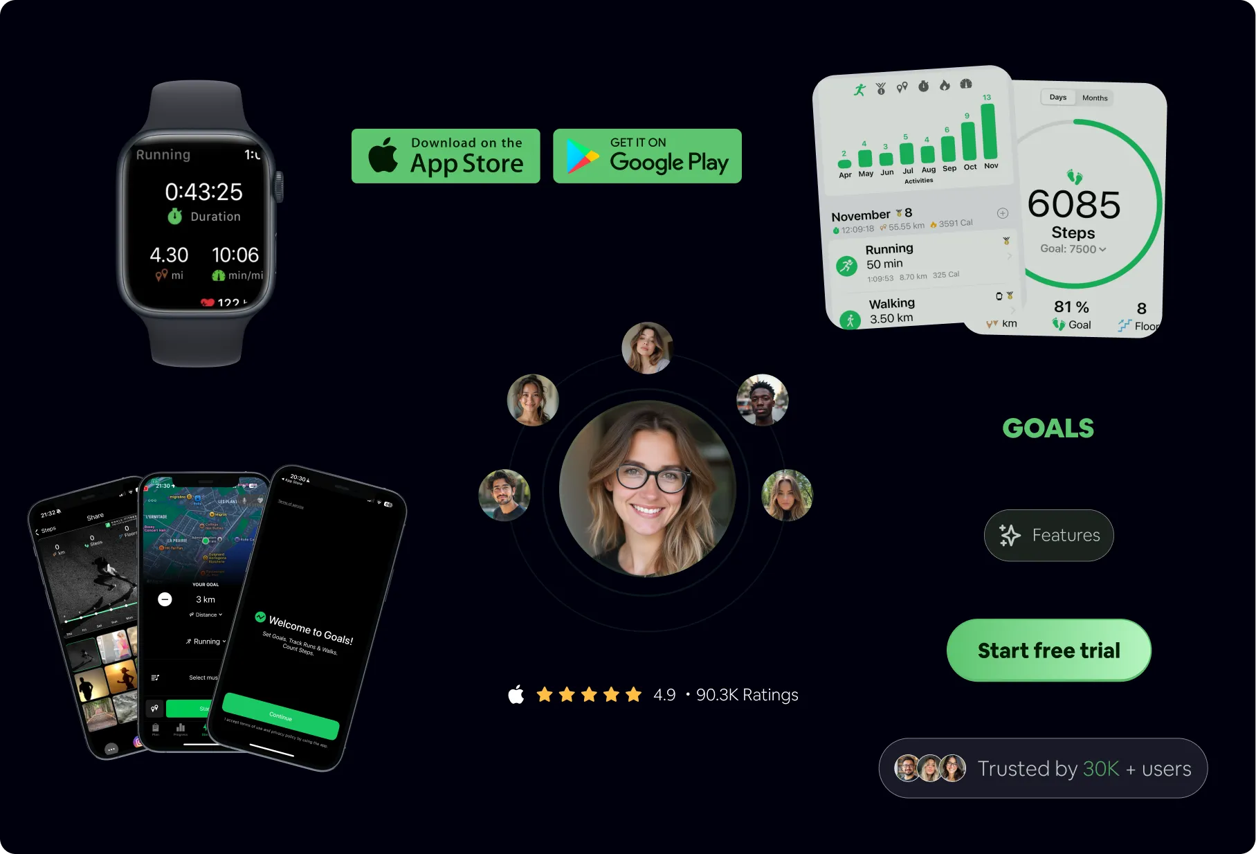
Mobile-first responsive redesign
Brand identity refresh while preserving signature green
Dark theme for premium, focused feel
Card-based layout for scannability
Logo modernization for better scalability
Problem-solution framework before features
Desktop landing page redesign
Mobile responsive layout
Logo refresh and variations
Design system documentation
Measurable Improvements
WCAG score: 52 → 87/100
Clear focal points: 0 → 3
Green identity preserved
Responsive: No → Yes (100%)
Note: The 4.7★ rating app achievements, redesign metrics (WCAG, hierarchy, responsiveness) reflect improvements to the landing page itself. As a portfolio project, conversion lift could not be measured with real users