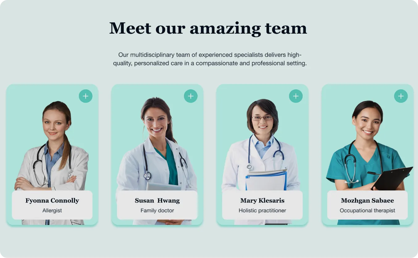
A Modern Design System that Elevates Trust & Clarity
design System
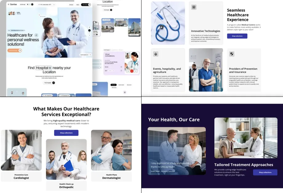
I started by analyzing 12+ competitor healthcare websites to understand visual patterns and trust- building elements in industry.
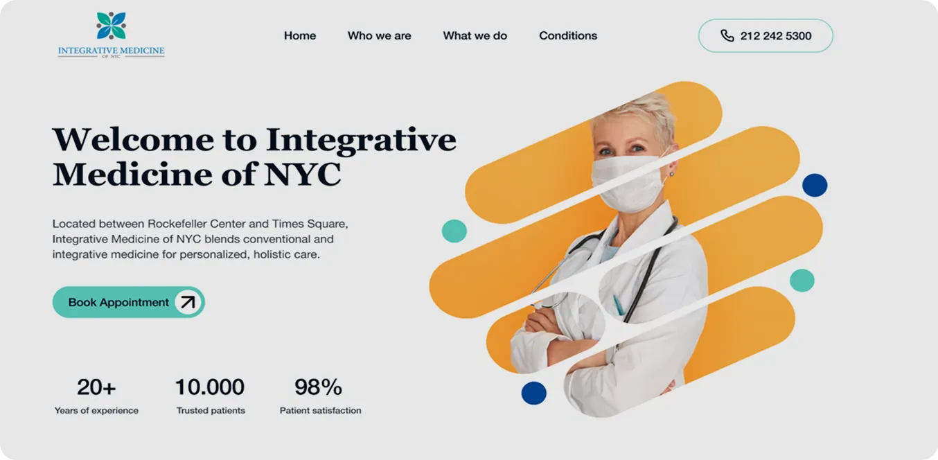
The palette is complemented by warm yellow accents to highlight key actions and guide attention naturally.
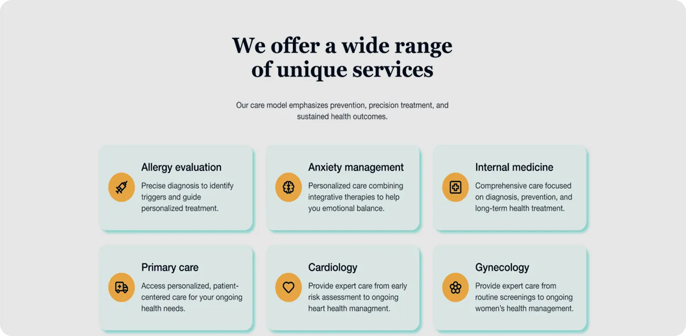
Clean, readable typography enhances scanability, helping users process information quickly and confidently.
Primary color
Turquoise
Evokes calm, trust, and holistic wellbeing.
Secondary color
Yellow
Adds warmth, energy, and highlights key elements.
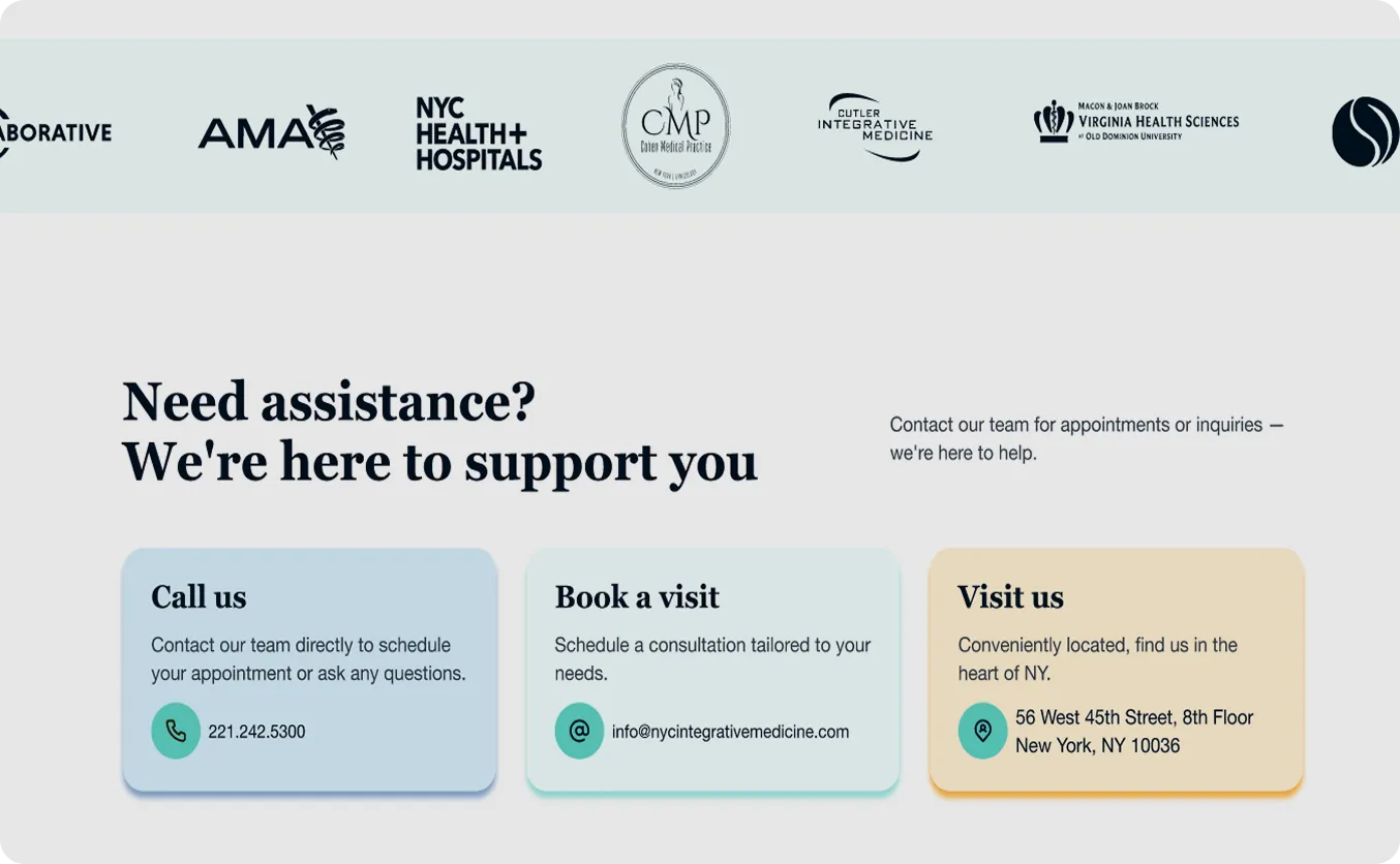
BG color
White
Keeps the layout clean, spacious, and easy to read.
Helvetia Neue
Is used for body text because of its clean, modern design, ensuring readability and a smooth reading experience.
Together, they create a balanced typography hierarchy that enhances clarity and the overall user experience.
Georgia
Is used for headings to convey professionalism, trust, and a sense of elegance, making key messages stand out.

